Coding against the clock: lessons from my midterm
I took an interactive design course as a graduate student in the University of Maryland's journalism program. For our midterm assignment, we were tasked with selecting one of five shared stories and building a responsive web page based on it — while racing against the clock. Like many creatives, mastering the art of letting go is a lifelong pursuit, balancing perfection in pursuit of *the vision* with the reality of meeting deadlines. This duality was central to my experience with this assignment. Here are some lessons from my midterm.
Assignment parameters:
- Find independently sourced multimedia elements
- UX/UI design
- Layout
- Good use of white space
- Color scheme
- Tags
- Image sizing & captions
- Clean code structure
- Responsive design
- SEO principles
- Headline
- Meta description
- Custom Google Font
- Pull quote (callout)
My process
I began by skimming the story options provided by our professor. The science-themed topic about the best locations to watch the 2024 solar eclipse caught my eye, aligning with my personal interests.
I started by sketching a rough wireframe, which, honestly, looked more like chicken scratches than anything resembling a website. But it gave me a starting point to begin building the site.
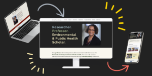
Next, I created a basic CSS style sheet, adding foundational elements like the heading, subheading and font types. Once I felt comfortable with the general direction, I turned my focus to sourcing multimedia components to complement the story. This included finding a feature image and gathering resources like NASA's videos and graphics about the solar eclipse.
At this point, I made a short-sighted decision: I opted to source 20 public domain images to complement each location referenced in the story. This proved to be far more time-consuming and difficult that I had anticipated. And I realized my mistake too late in the process.

Faced with a ticking clock, I had two options: to finish the template with all the images and risk submitting my assignment past the deadline, or quickly code a new, more simplistic layout without the imagery. Ultimately, I decided to stick with my original vision. It was more important to me to create a better design and practice my skills, even if it meant sacrificing a few points for being late.
In the end, I completed a page with room for improvement. Considering the time constraints, and the scope I set myself up for, I was satisfied with how it turned out. I received an A- on the assignment, and my professor deducted 2 points for a late submission instead of 5.
"I think you spent more time on certain things than you probably should have - only in the interest of making it better. :-)", my professor commented.
Check out other web designs
Related Posts